This month, we've rolled out features designed to make emissions data review faster and more insightful. From pivot tables and charts to spot outliers, to more control over how emission factors are applied during import, these updates will help you analyse and refine your carbon inventory with greater confidence.
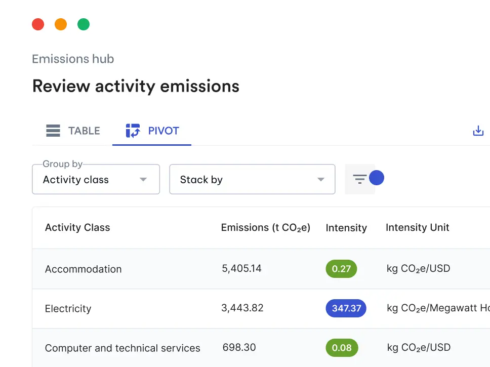
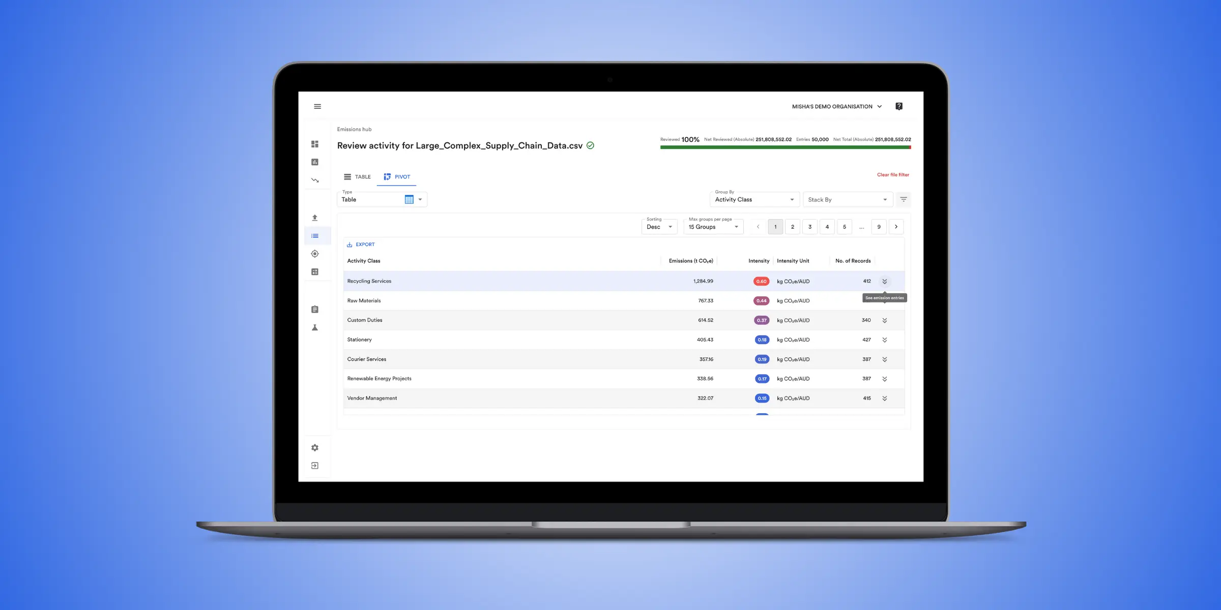
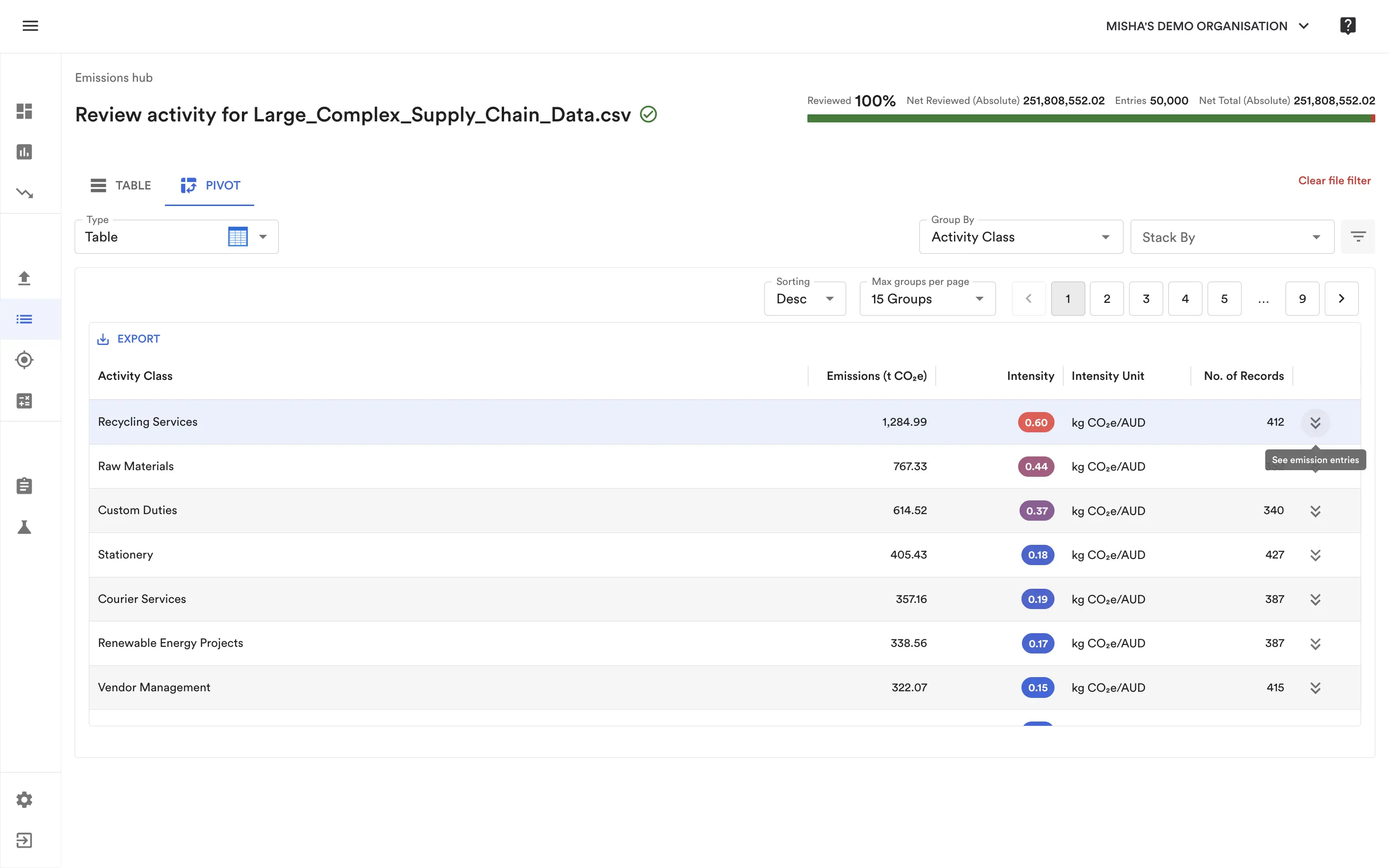
Spot outliers in emissions with Pivot Tables and Charts
We’ve brought a much loved Excel feature directly into Avarni to help you analyse your emissions data and fix errors even more efficiently: Pivot Tables and Charts.
View emissions directly in the emissions hub in a table or chart view, with the new table view including emissions intensity metrics to easily spot outliers and scrutinise your most emissions intensive categories.
If you want to then see the activities included in a group on the pivot table/chart, click the drill down button or graph section to see them in the emissions hub, allowing you to scrutinise and correct any potential outliers or mistakes.
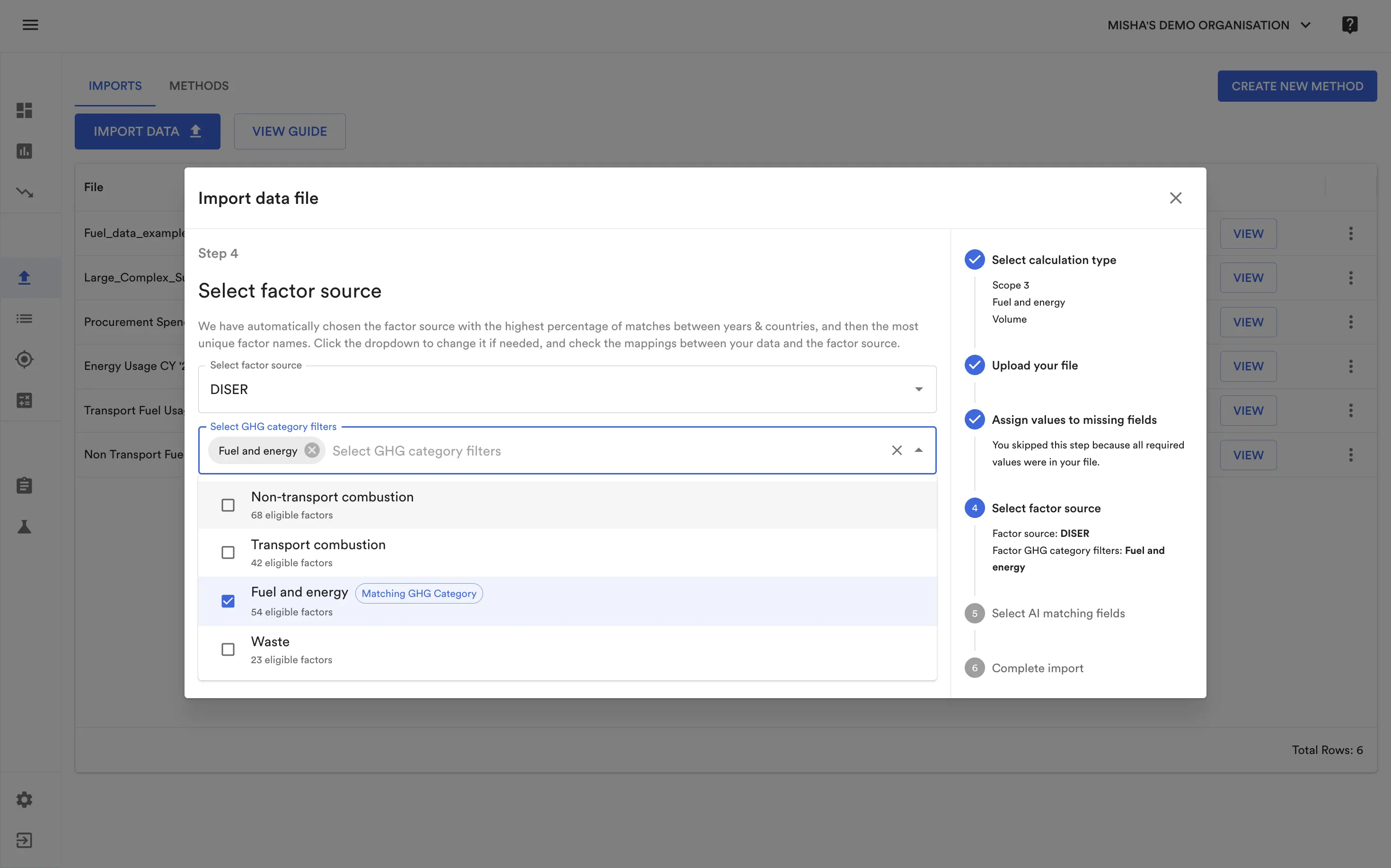
Calculate upstream fuel and energy and market based emissions more efficiently
We’ve brought extra controls to the import process to allow you to control which emission factors are mapped by the AI to your data, with Factor category filtering.
Previously, there was no way to prevent the AI from potentially matching a well-to-tank emission factor with a combustion activity, resulting in a much more lengthy review process for these categories. Now, by giving you the option to choose which categories emission factors are pulled from, you can guarantee that the AI will only choose from the set of emission factors you specify.
This new functionality is now available in both the Import Wizard and Methods.